Client: Dailyhoa
Service: Naming, Brand Positioning, Visual Identity, Production
Creative Director: Two Nguyen
Project Manager: Thinh Nguyen
Planners: Hanh Nguyen, Linh Pham
Designers: Vu Nguyen, Phuong Van
Planting the seed
Entering the already crowded flower retail scene in Hanoi, dailyhoa needs to decide where it will stand.
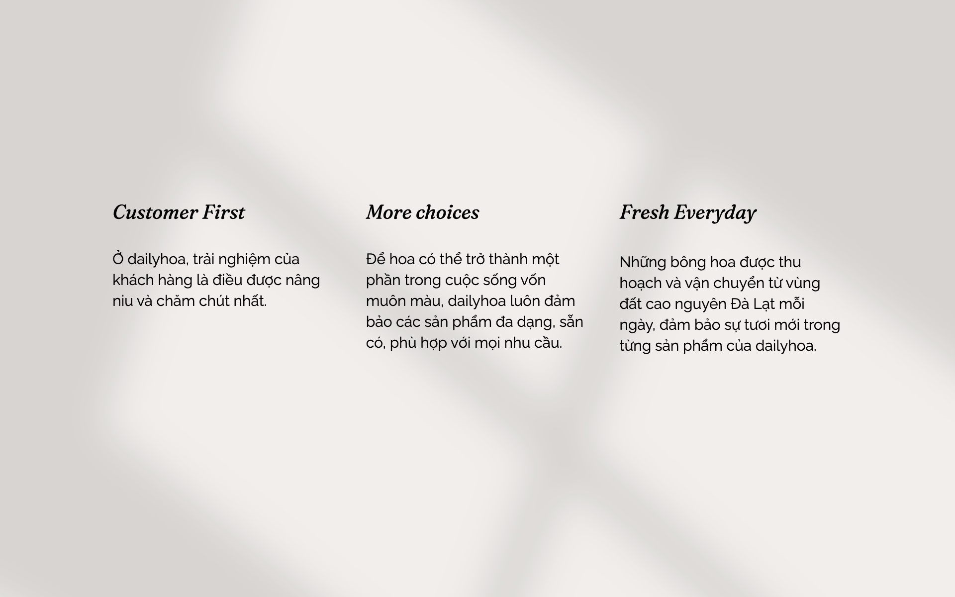
Unlike most “artsy boutiques” with high-priced and designed-to-order bouquets, dailyhoa strives to be the destination for everyday, affordable flowers. A brand that focuses more on using flowers to embellish people’s lives rather than embellishing flowers.
The name “dailyhoa” stems from that idea. “daily” reflects the brand’s purpose of making flowers a part of everyday life, while also can be understood as “đại lý” – the traditional convenience stores in Vietnam – which indicates accessibility, affordability and wide range of choices.
Nurturing the bud
With the new positioning, the visual system is developed to reinforce the idea of everyday flowers.
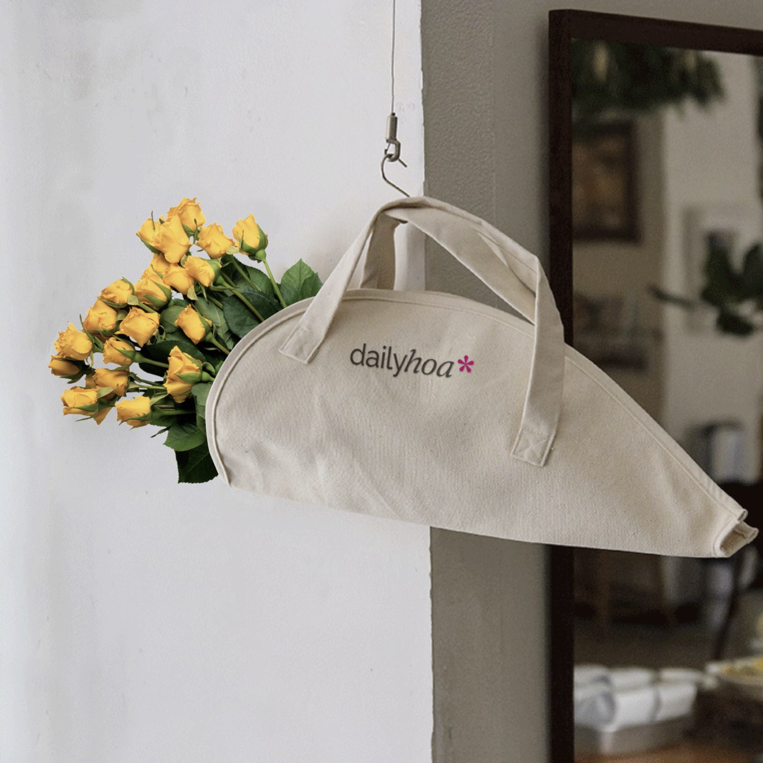
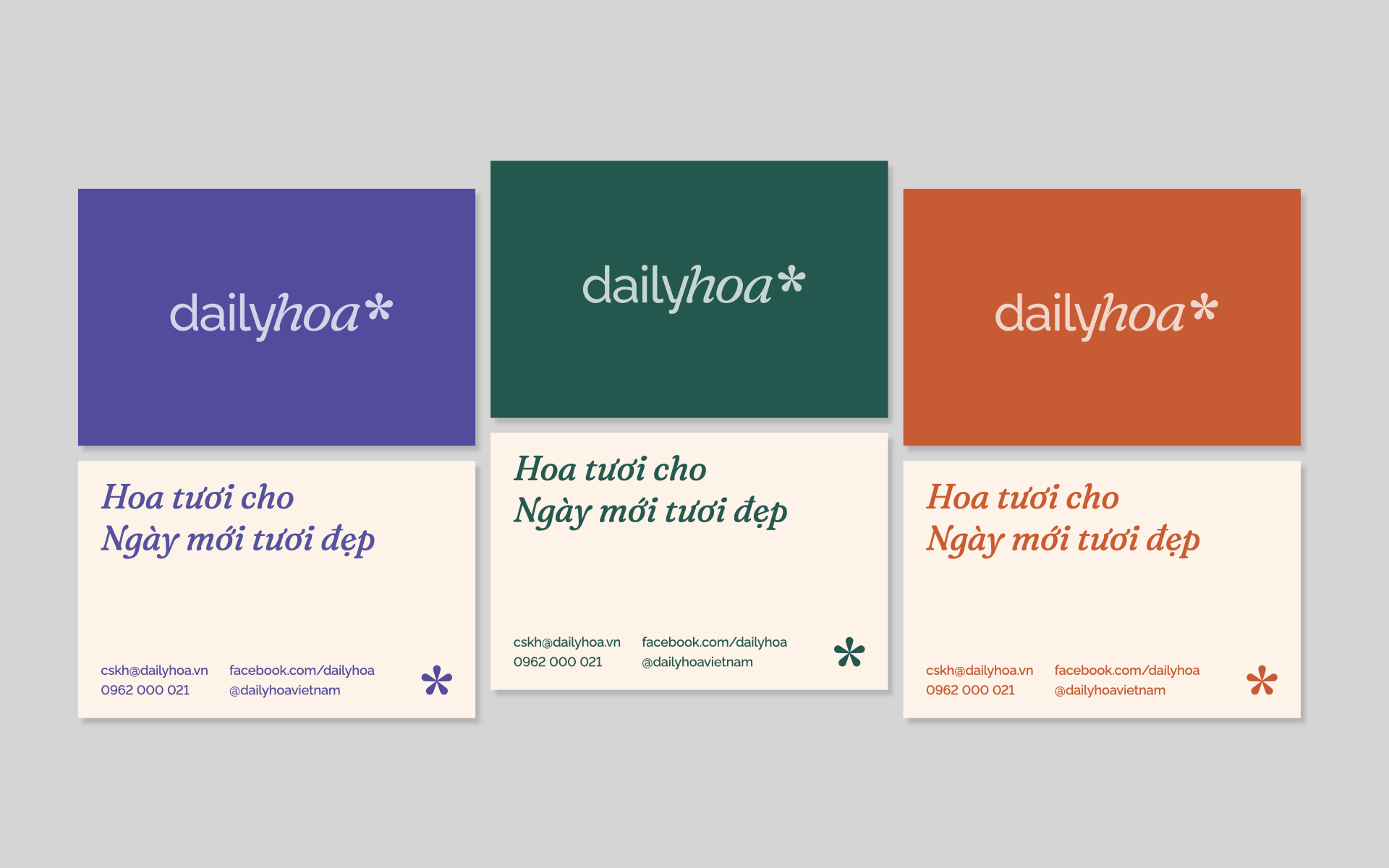
The logotype carries a simple yet distinct look. The logo conveys its approach with a friendly, sans-serif font on the first half – “daily” while “hoa” has a more stylized look with a 72-degree skewed to embrace the feminine vibe of flowers. With a little flower on top, all components come together to create a unique and outstanding symbol.
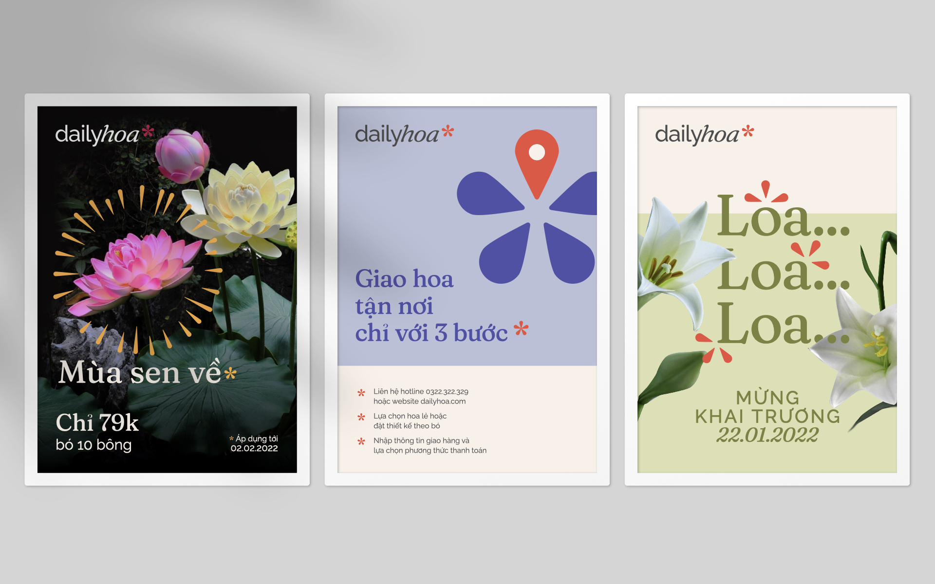
Where the petals unfold
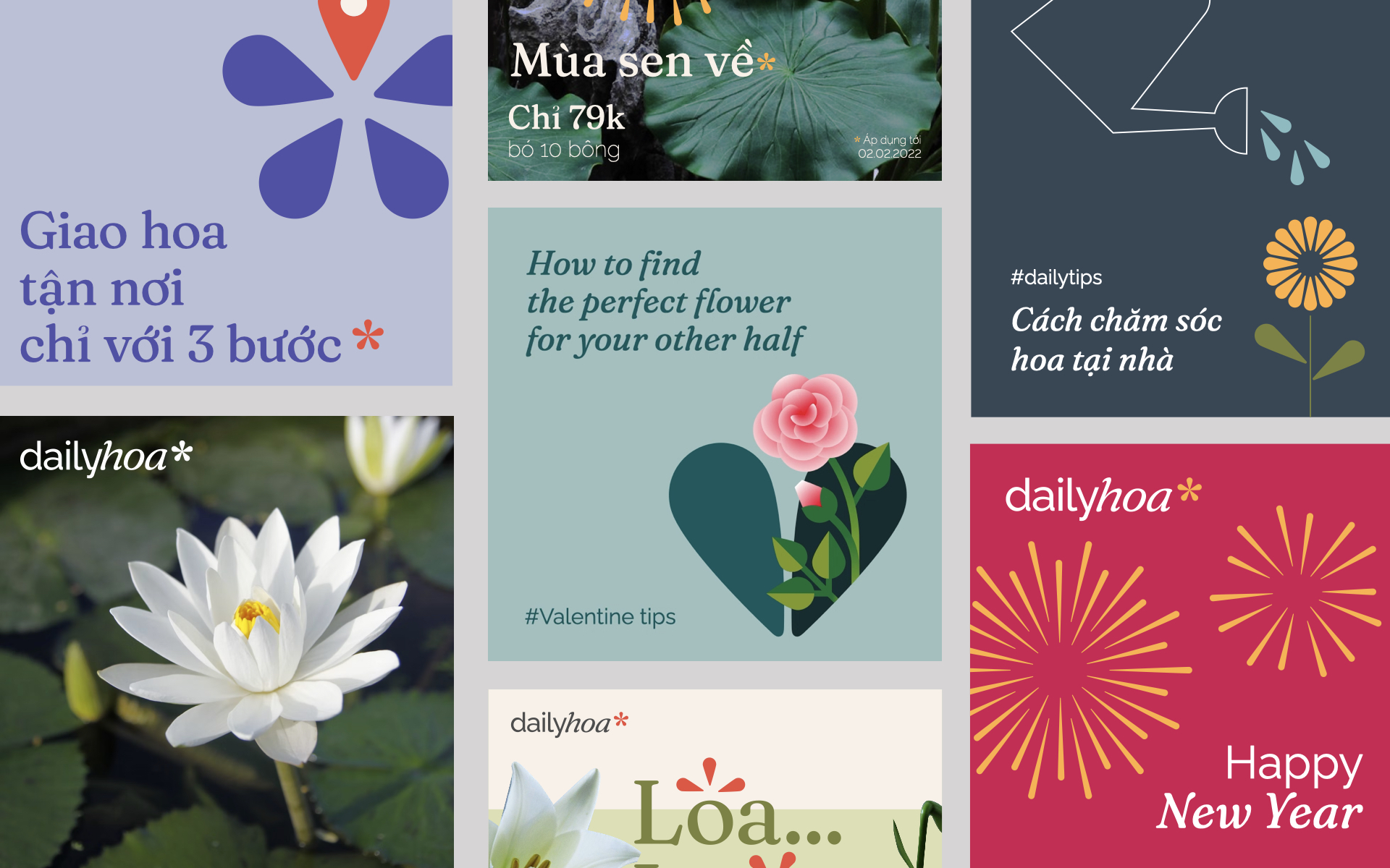
As a brand for everyday people, dailyhoa wishes to make everyday life more vibrant through its diverse collection of flowers, satisfying every need for every occasion. To align with dailyhoa’s intention, our visual system also incorporates a range of color palettes.
Aside from the colors, the main component for the key visual is the little flowers that have appeared on the logo. We utilize the simple five-petal drawing as the base of our visual.
With all components in hand, we have created an easy-to-use and easy-to-adapt system.
Brand in full bloom
Customer experience has always been the top priority. Every brand touchpoint is designed as simple cues for functionality. With the five-petal flowers as the key visual, every aspect of the brand is catered to customers’ needs.