Client: UNFE
Service: Campaign Identity, Messaging, Communication, Merch Production
Creative Director: Two Nguyen
Project Manager: Hanh Nguyen
Producer: Nam Nguyen
Planners: Linh Pham, Hanh Nguyen
Designers: Linh Pham, Kay Nguyen, Vu Nguyen
Stand against discrimination, stand with Pride.
Despite the efforts of numerous organizations and individuals to educate the mass on LGBTIQ+ subjects, individuals, including students, of this community are still facing heavy discrimination and violence everyday.
Meanwhile, schools in Vietnam are mostly ill-equipped to deal with such issues, whether with the lack of specialists or proper knowledge of SOGIESC (an acronym for sexual orientation, gender identity, gender expression, and sex characteristics), which makes the environment unsafe for LGBTIQ+ students.
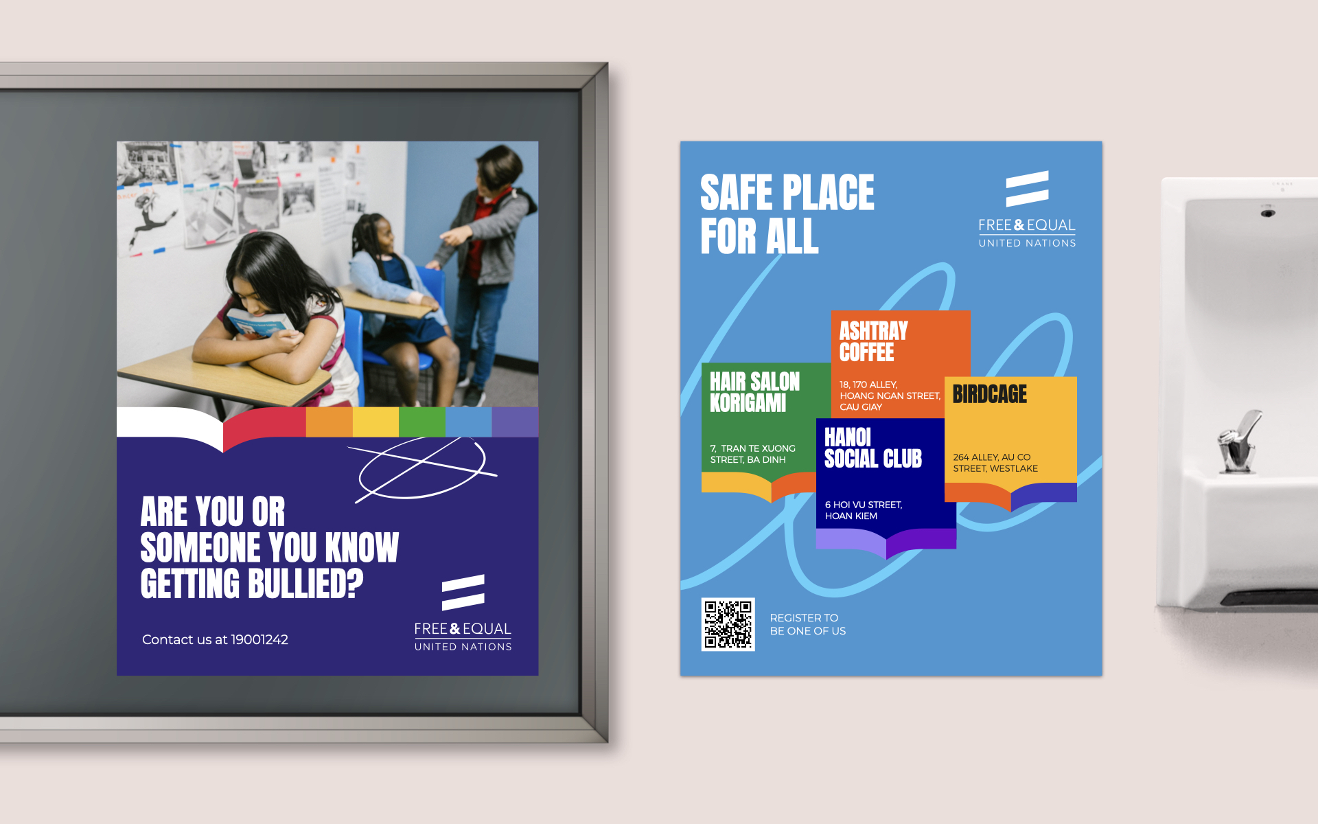
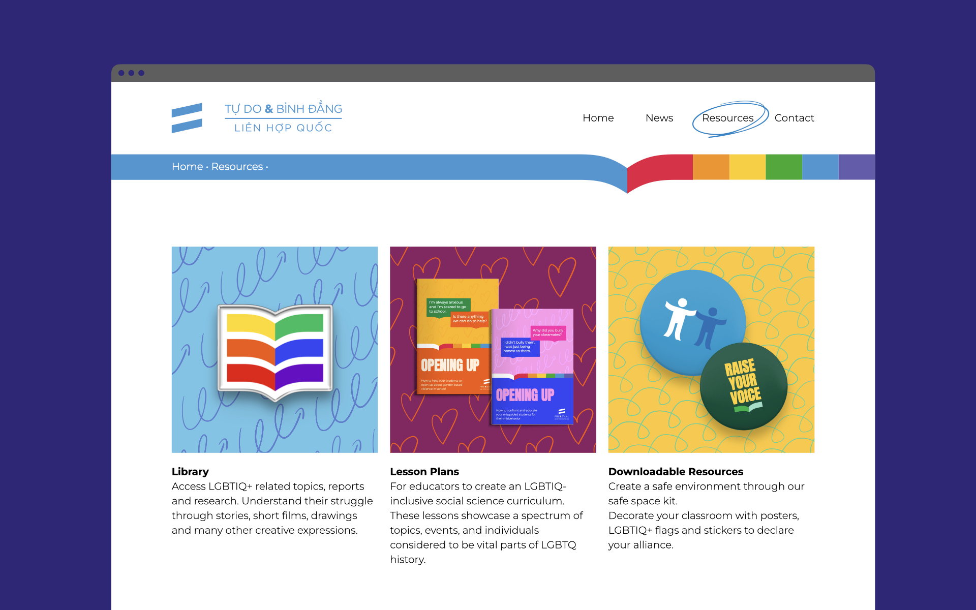
Recognizing the problem, UN Free & Equal Global Campaign in cooperation with University of Science and Education (UED) launched “Stand with Pride” campaign to raise awareness of gender-based violence and discrimination towards LGBTIQ+ students among future educators in Vietnam, and encourage these future educators to take action.
A symbol of safe and inclusive education.
Every cause needs a symbol to stand out. For the campaign, we collect inspiration from the iconic pride flag and combine it with the universal sign of education to create a distinct mark that will become the base for our visual system. The mark is designed to be distinctive yet easily recognizable for future educators.
Moving towards a common goal.
Visual has always been a trustful companion of language. Thoughts and ideas written on paper or computer, with the help of visuals can be realized and pushed to a new level. As the goal of the campaign is to spread awareness and educate future educators on SOGIESC, our key visual also needs to assist in getting the message across while not losing its distinct looks.
To perfectly capture the nature of the campaign, we set out 04 principles to follow. These principles will help enhance the campaign’s message while also ensuring all designs stay consistent across all platforms.
Pay homage to the LGBTIQ+ community.
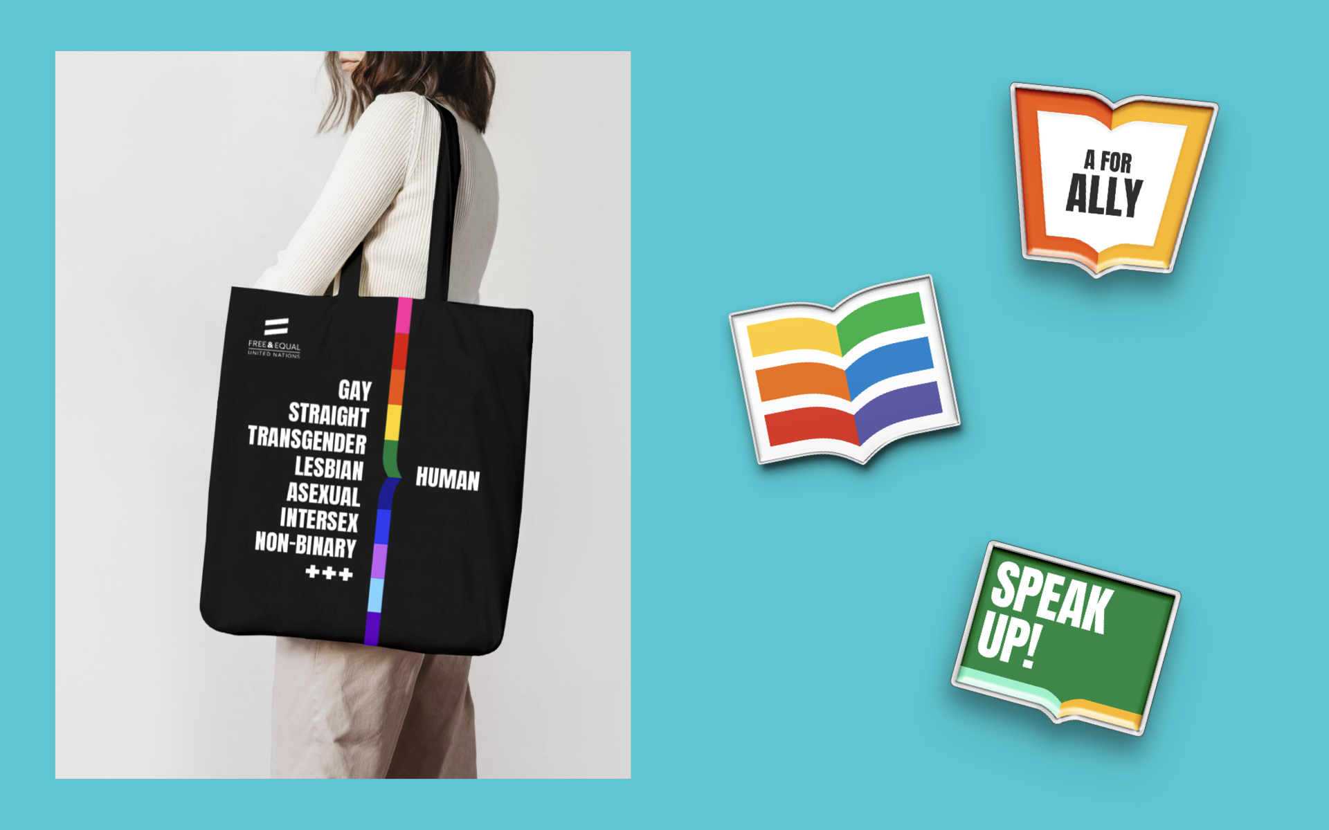
We understand the importance of representation and inclusivity for the community. We paint the campaign with a spectrum of vibrant and bold colors, showing the many identities and diversity of the LGBTIQ+ community. From there we want to create an open discussion by looking at different groups of people’s perspectives on different topics.
Accompany the colors is our customized version of Anton by Google. In alignment with the purpose of the campaign, we adjusted the font to have custom glyphs with open-type features to make it easier for anyone – from future educators to education institutions – to use and adapt in their creative ways.
Inspire a new generation of educators.
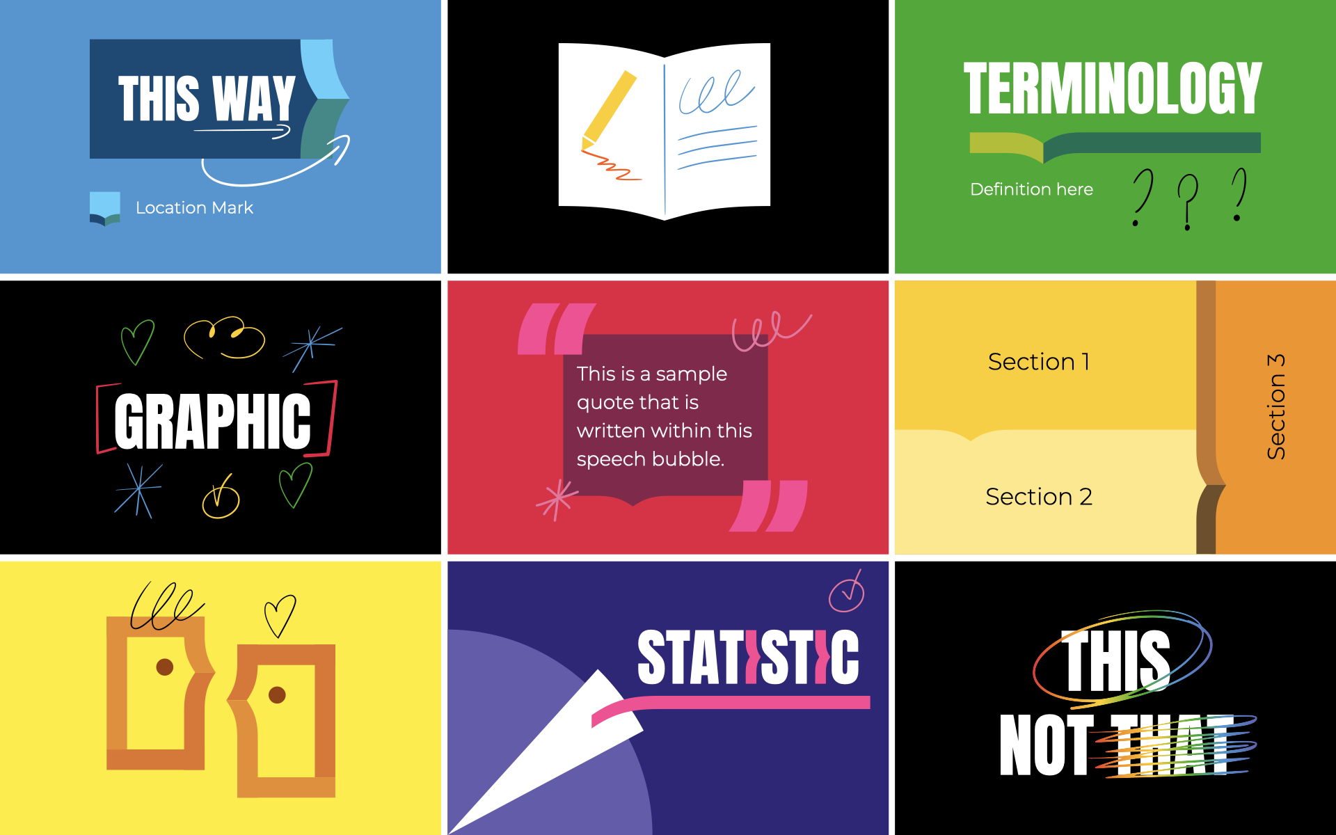
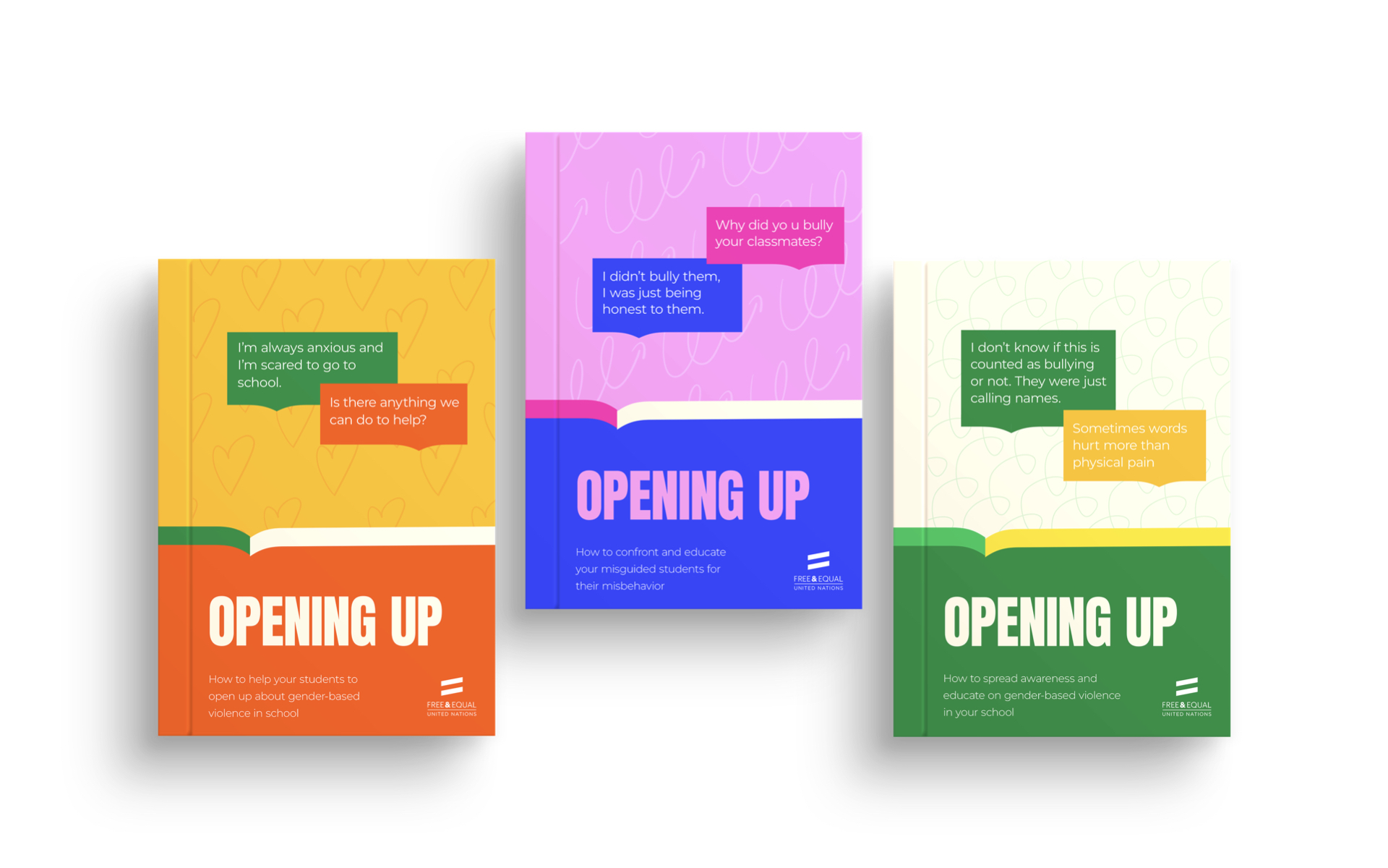
We believe information doesn’t have to be dull, especially technical information. With the right ingredients in hand, we can make education fun, engaging, and easy to consume while remaining accurate and sensible to the topics. With our mark as the base, we explore different ways of visually presenting information.
From there, we hope to inspire future educators to learn, creatively produce their content, and spread their new-found knowledge.